CASE STUDY • UX UI
Petsmart App
Problem
Navigating the Petsmart app's is not intuitive. Finding the product you want is more complicated than you should be.
Solution
Simplify the process of finding products on the PetSmart app by removing non-important information and redesigning the app's navigation.
My Role
Duration
Software
UX/ UI Designer
2 months
Software
Defining the problem
It is hard to find products on the PetSmart app. The different pet categories are hidden and there is no clear direction on where to find products.
This is what the Petsmart app looks like currently:
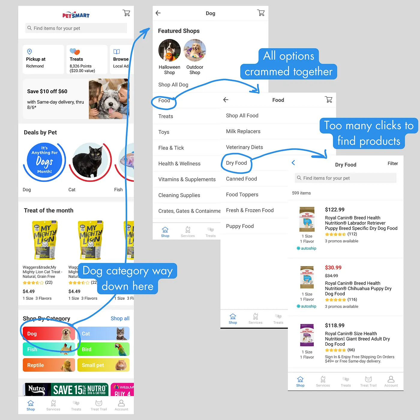
Petsmart app flow
The product page and filter process are not terrible but after using the filter the results don’t display the changes that were made.
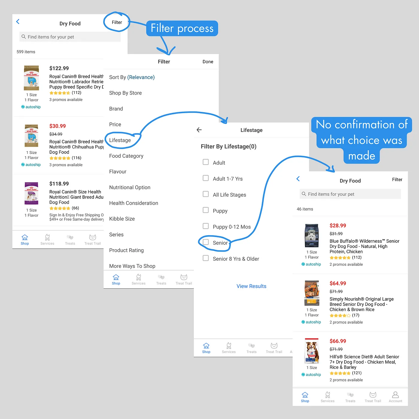
Filter process flow
Research
Interviews
I conducted a series of interviews with 9 people to assess the range of their problems. I was able to learn about their experiences with shopping apps and the emotions that arose from those experiences.
Results
Some results are as follows:
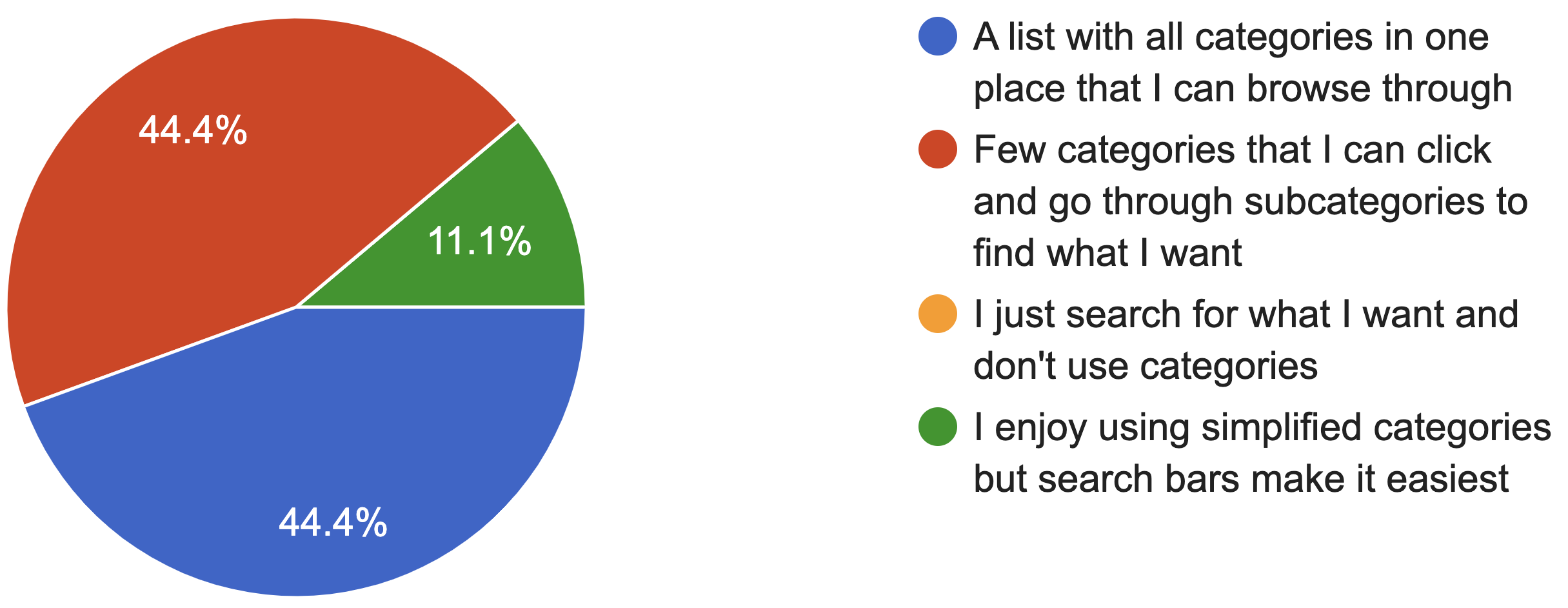
What type of categories section do you like most on a shopping app?
9 responses
What I Found
From the interviews I managed to notice some patterns:
Key Takeaways
- Almost all people were used to shopping apps.
- Most people need a categories menu when shopping.
- Most find that browsing categories to help them shop.
User Persona
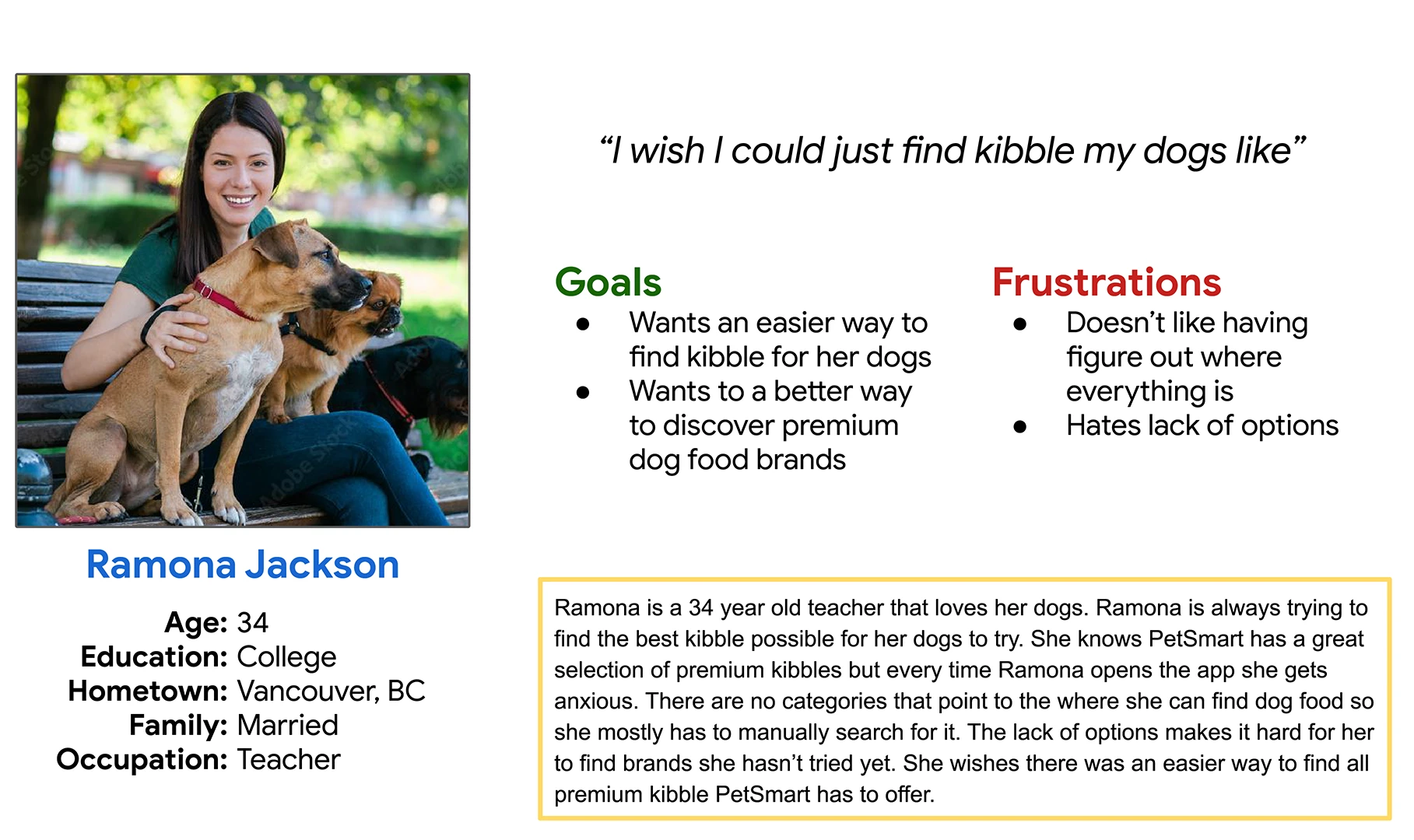
To help visualize this, I created a user persona called Ramona:
Ideation
Wireframes
Taking into account what I learned from the interview stage, I decided that the best course of action would be to focus on simplifying the browsing experience by putting pets first.
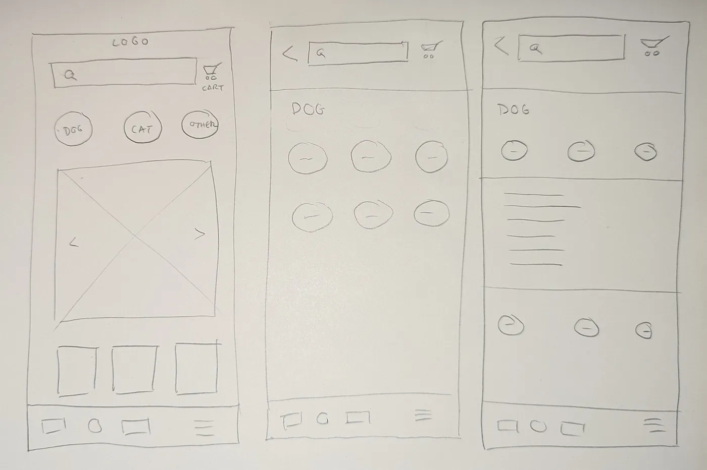
I put my idea of what the app could look like into Paper Wireframes.
Paper Wireframes
First thing the user finds would be the type of pet he wants to buy products for, everything comes after that.
After choosing the pet, a list of basic categories of products appears specific for the pet.
By choosing one category, the user can pick from a list of more specific subcategories before finally arriving at the products page.
Medium Fidelity Prototype
Expanding on the design, I used Figma to build a Medium Fidelity Prototype of what the app would look like.
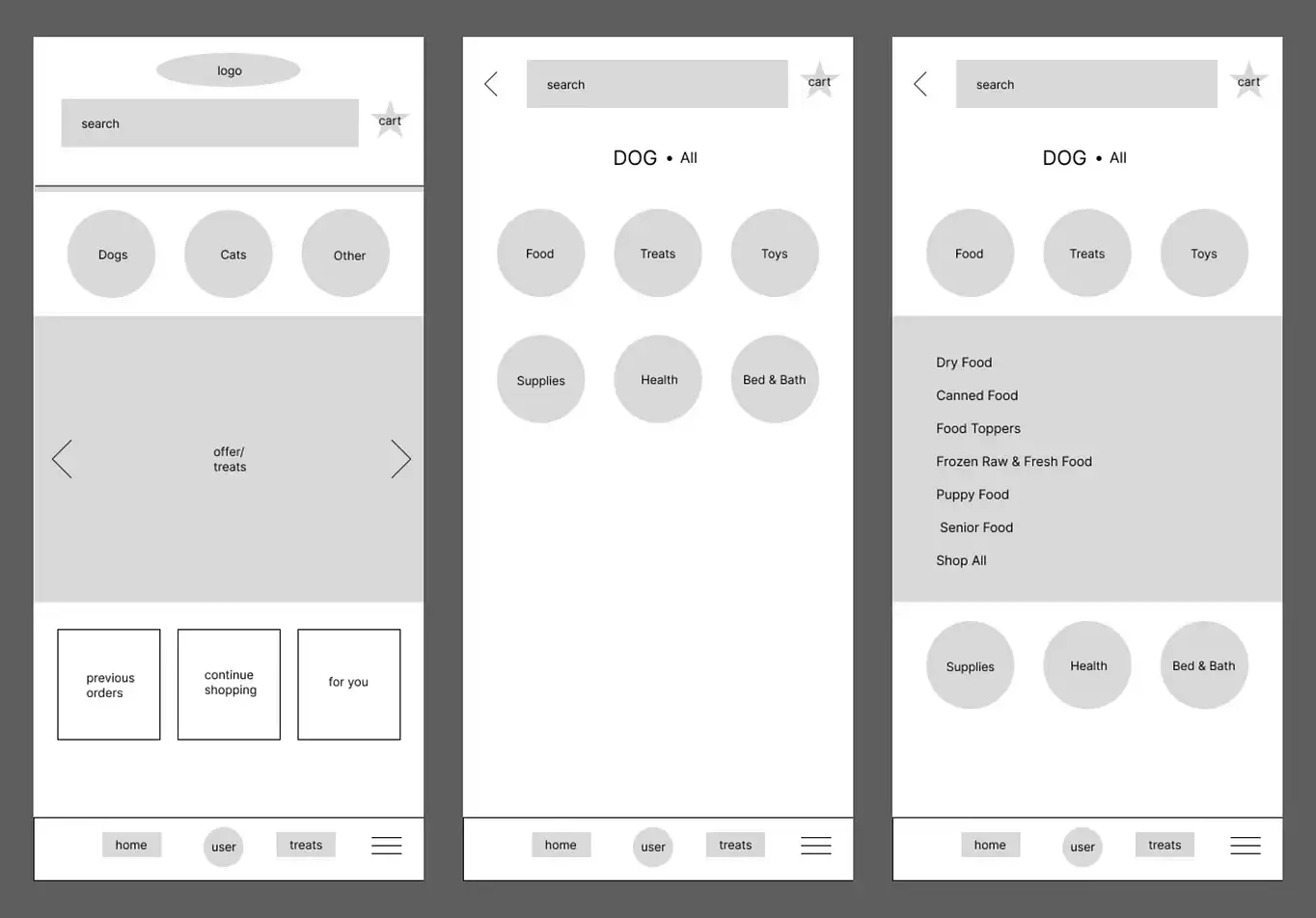
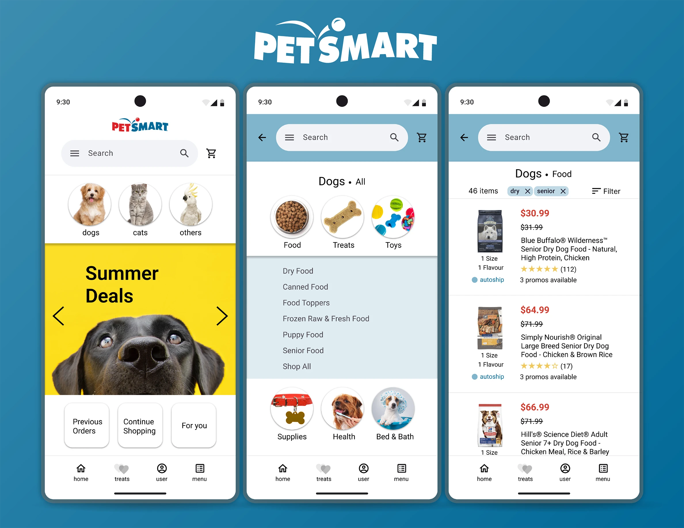
Home page with pet categories
The user can find their type of pet right away and go straight to the categories of products available.
In this case, the user clicked on “Dogs” and then chose the “Food” option, where a menu with subcategories appears ("Dry Food", "Canned Food", etc).
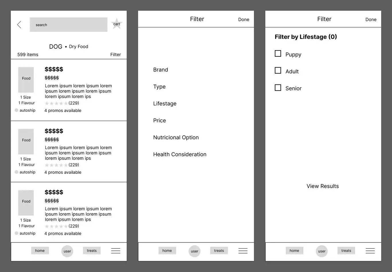
Product page with filters
The user would see the products they want (in this case “Dry Food”) and can filter ever further from a couple of options ("Brand", "Type", "Lifestage", etc).
Usability Testing
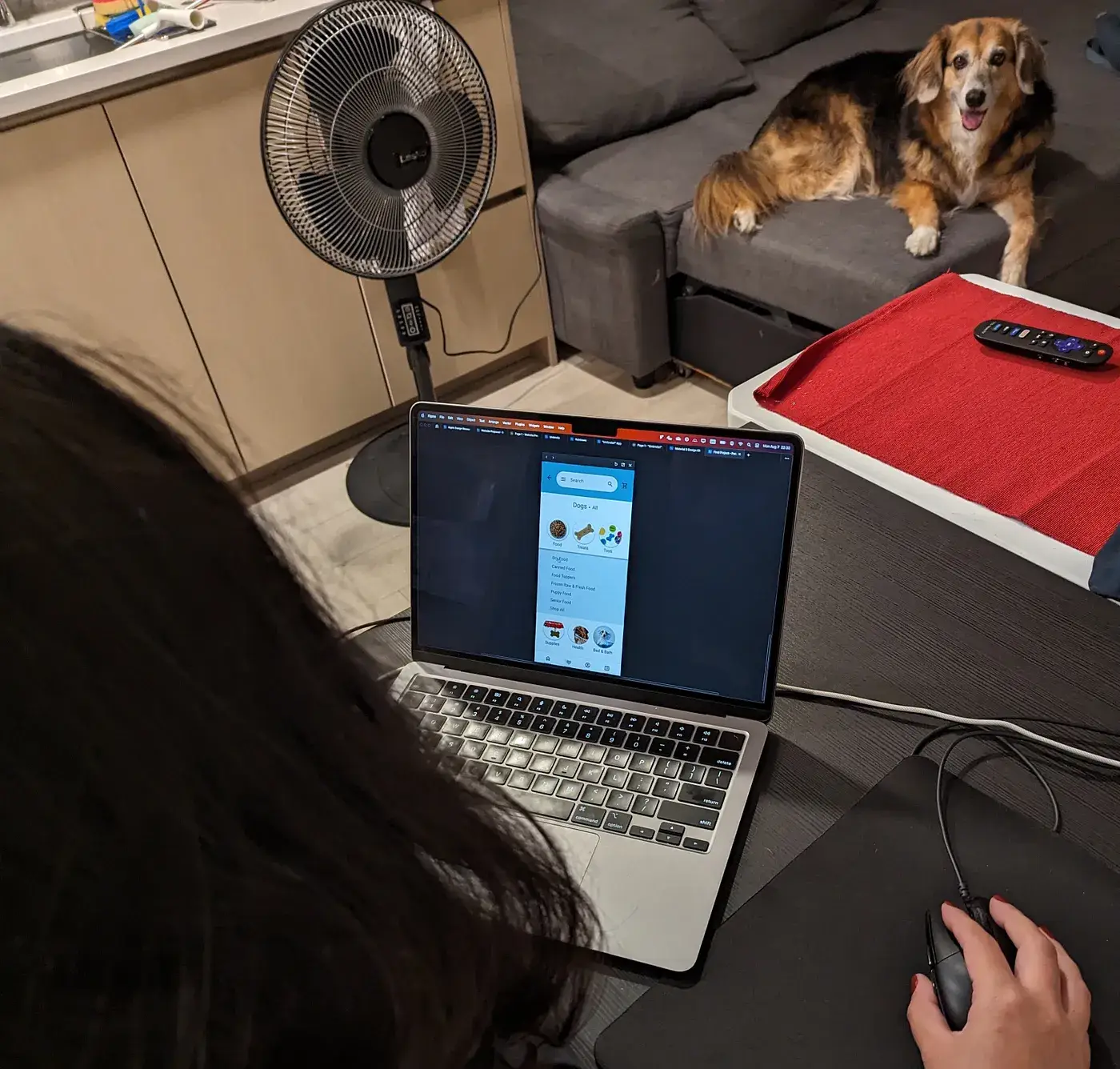
Usability Testing — Bia
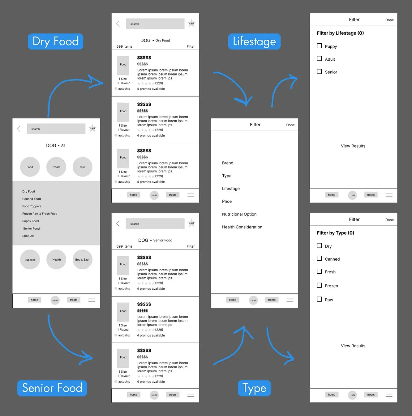
Users were instructed to find Dry Food for a Senior dog.
Two paths were created using Figma:
User Paths
- One where they could choose:
Dog > Dry Food > Filter > Lifestage > Senior. - Another where the user could choose:
Dog > Senior Food > Filter > Type > Dry Food.
All choices would lead to the same product page in the end.
User Testing flow
What I found
Although all users managed to reach the end of the test, several issues arose in the user experience and interface:
Key Takeaways
- One user felt the final product page didn’t visually reflect the changes he had made during the filter process.
- Some users took longer deciding which option to choose during filter process.
- Most users felt the options looked bland and the same.
These issues were remedied during the High Fidelity Prototype phase.
Iteration
High Fidelity Prototype
Taking into account the experiences of users during User Testing, once again I took to Figma to build a High Fidelity Prototype of the app.
For this project I used the Material 3 Design Kit for Figma.
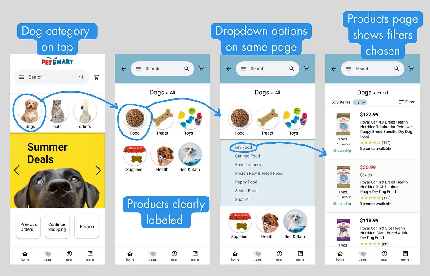
Home page to Product page
Taking user feedback into account, I focussed on making the options stand out from each other while still simplifying the process.
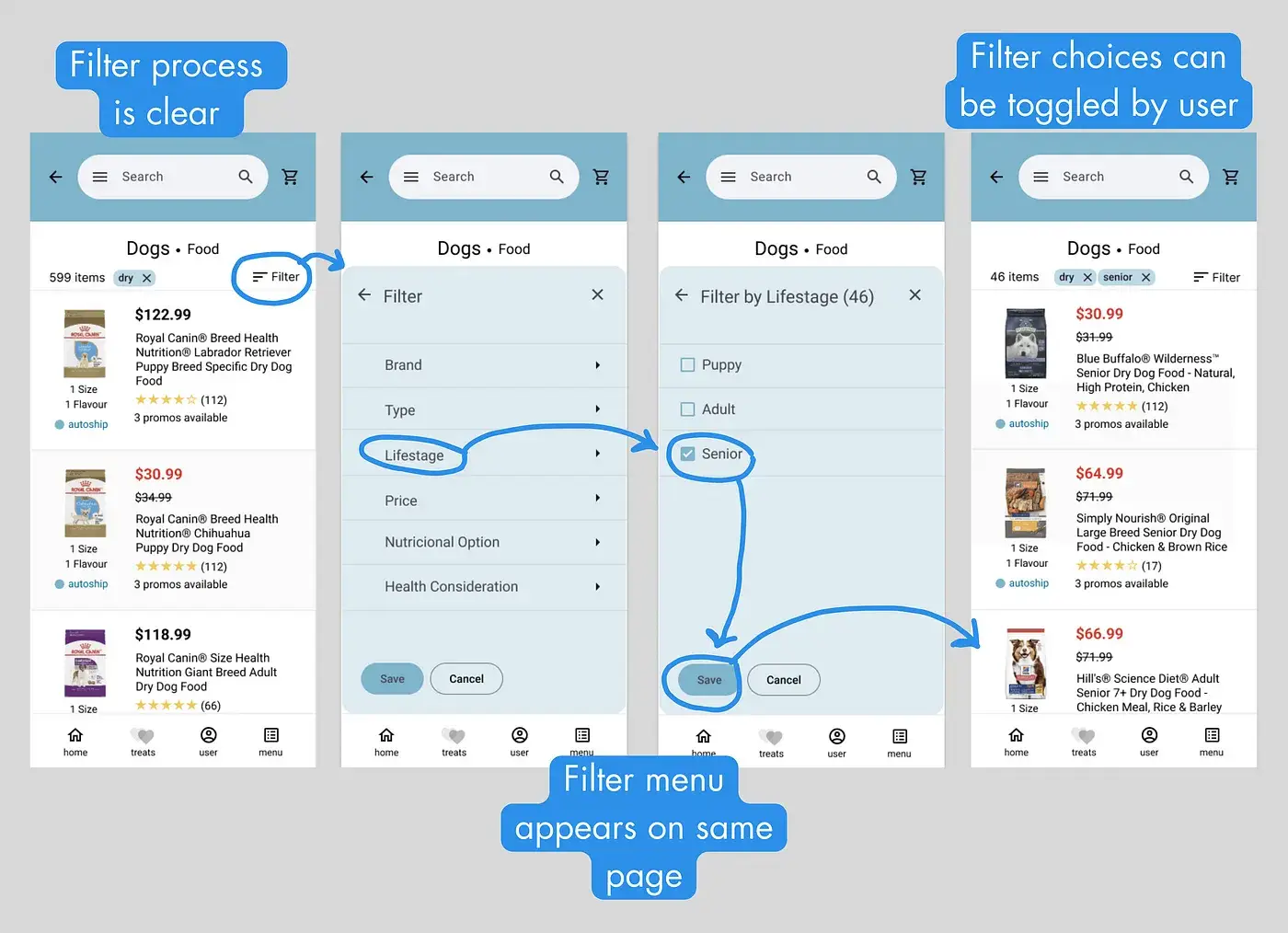
Product page through Filter process
Following other feedback, I added visual representations of any choices made during the Filter process. That way, the user can see what is being filtered and easily turn off any of the options made.
Reflection
Based on the design process, I learned a couple of lessons:
- Keep the plan: Try to remember why the process is being made and follow original outlines
- Test your assumptions: The testing process is invaluable to achieve a design that is truly use friendly
Next Steps
Next steps for the project would be:
- Extend Usability Testing
- Implement design into functioning product
Thank you for reading!