CASE STUDY • UX UI
Vancouver Aquarium Website
Problem
The Vancouver Aquarium is a public aquarium located in Stanley Park in Vancouver, British Columbia, Canada.
Their official website allows users to purchase tickets and also offers membership that allows unlimited annual access.
Vancouver Aquarium website
Unfortunately the ticket buying process is unclear and overly complex.
The website also does a poor job showcasing the benefits of signing up for a membership.
Solution
- Simplify the entire buying process from landing page to checkout.
- Showcase the benefits of signing up for a membership over buying single tickets.
My Role
Duration
Software
- UX/ UI Designer
- UX Researcher
2 months
Software
Defining the problem
For this project we had to analyze the Vancouver Aquarium website and come up with possible problems the organization would ask us to solve, provide hypothesis on how to solve them, test said hypothesis and provide recommended solutions.
Based on our analysis of their website, we came up with 2 problems the Vancouver Aquarium could be going through:
Problems
-
Decrease in General ticket sales
The organization is experiencing a significant decline in general ticket sales that is negatively impacting revenue streams and overall profitability.
-
Decrease in membership ticket sales
The organization has observed a notable decline in membership ticket sales, impacting both short-term revenue and the long-term sustainability of its community and engagement initiatives.
Based of these problems we formulated 3 key hypothesis:
Hypothesis
- We believe that the unclear design and inconsistent user interface on the landing page cause a decrease in ticket sales.
- We believe that the poor showcase of the benefits of the membership compared to the single ticket and the overall lack of information is resulting in a lower percentage of the membership compared to single ticket.
- We believe that the complex event ticket purchasing process and lengthy user journey are hindering users from completing their purchases, ultimately leading to reduced ticket sales.
Research
Usability Testing
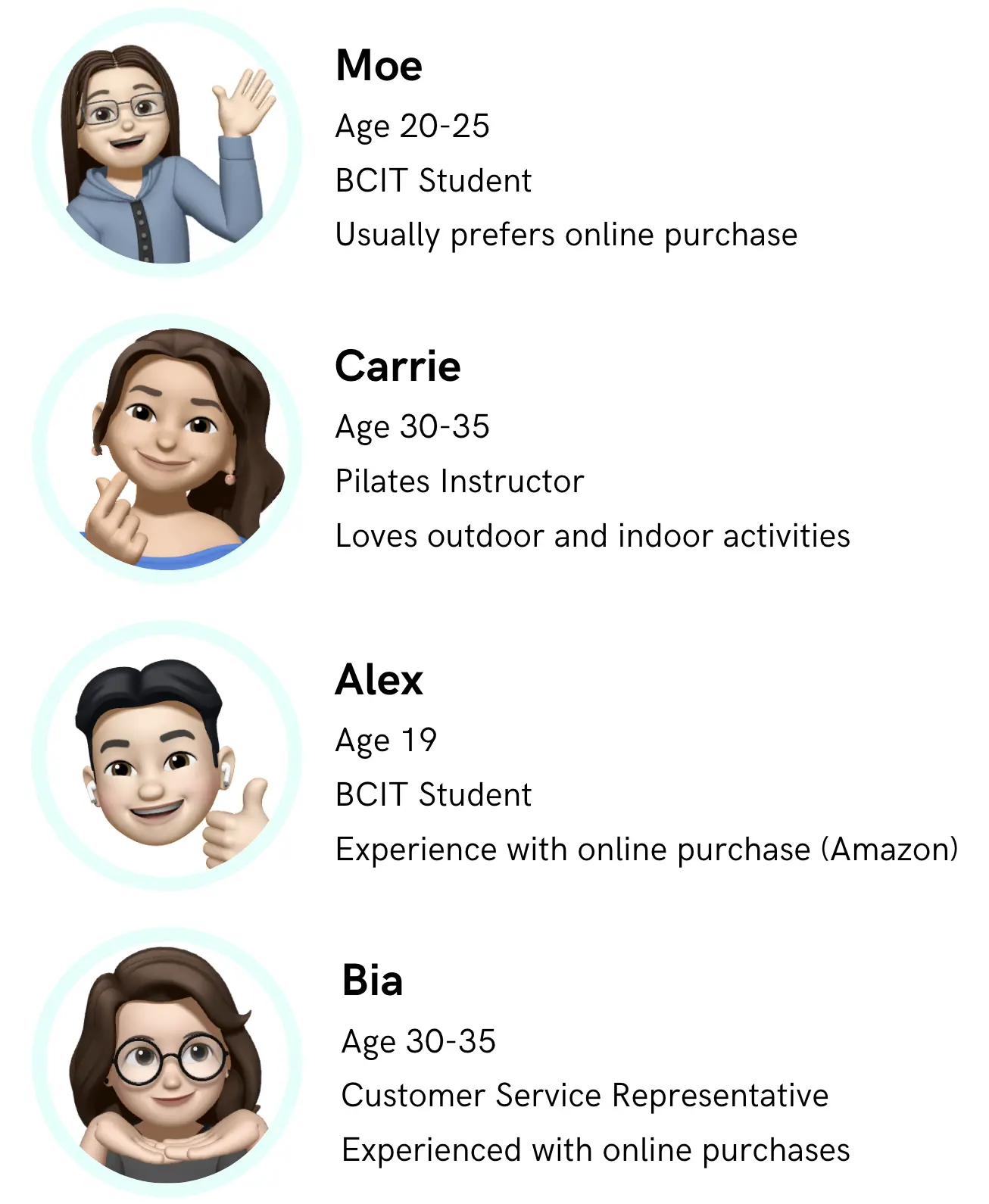
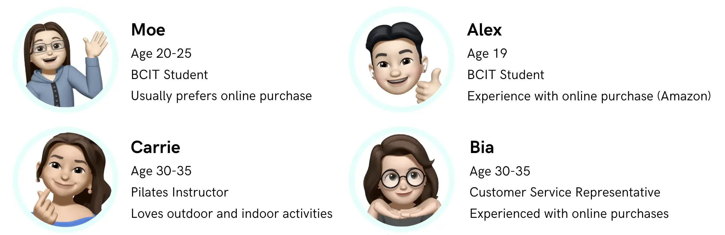
Our team identified appropriate testers by reviewing responses gathered from screening questions. The questions centered around location, experience with online purchases and aquariums, and preferred device for online purchases.
We performed 4 in-person Usability Testing sessions: on the original Vancouver Aquarium website.
Testing Overview
- Each test had 3 tasks .
- Each task lasted 5 minutes.
- Each test had a in-person Moderator.
- Each test was reviewed by 2 Observers.
Usability Testing - Carrie
Participants had to complete the following tasks:
User Tasks
- Purchase a single ticket on the official Vancouver Aquarium website.
- Purchase the tickets for two people for two different dates with options that the tester think the best.
- Purchase a ticket for a specific event for the available date
The tests were recorded to capture how users interacted with the system.
After finishing the tests, users answered SUS (System Usability Question) questions.
The average SUS score was 33.75. The industry average score is 68.
The Vancouver Aquarium website SUS score is 50% below the industry average.
What we found
Key Takeaways
- Users spent some time browsing the navigation bar and each user took different paths to get to the booking page.
- Users did not consider purchasing a membership despite multiple call-to-action buttons along the user path.
- Users found it difficult to check the schedule and purchase tickets for a specific event.
Ideation
High Fidelity Prototytpe
With testing done we went into the design phase.
Taking into account what we learned from the testing stage, we wen ahead with attempting to redesign the website's checkout process.
Using Figma, We put our recommendations of what the website could look like into High Fidelity Prototype.
Solution
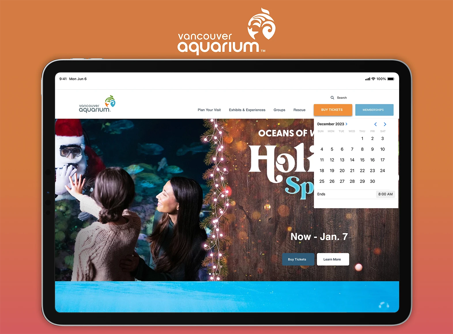
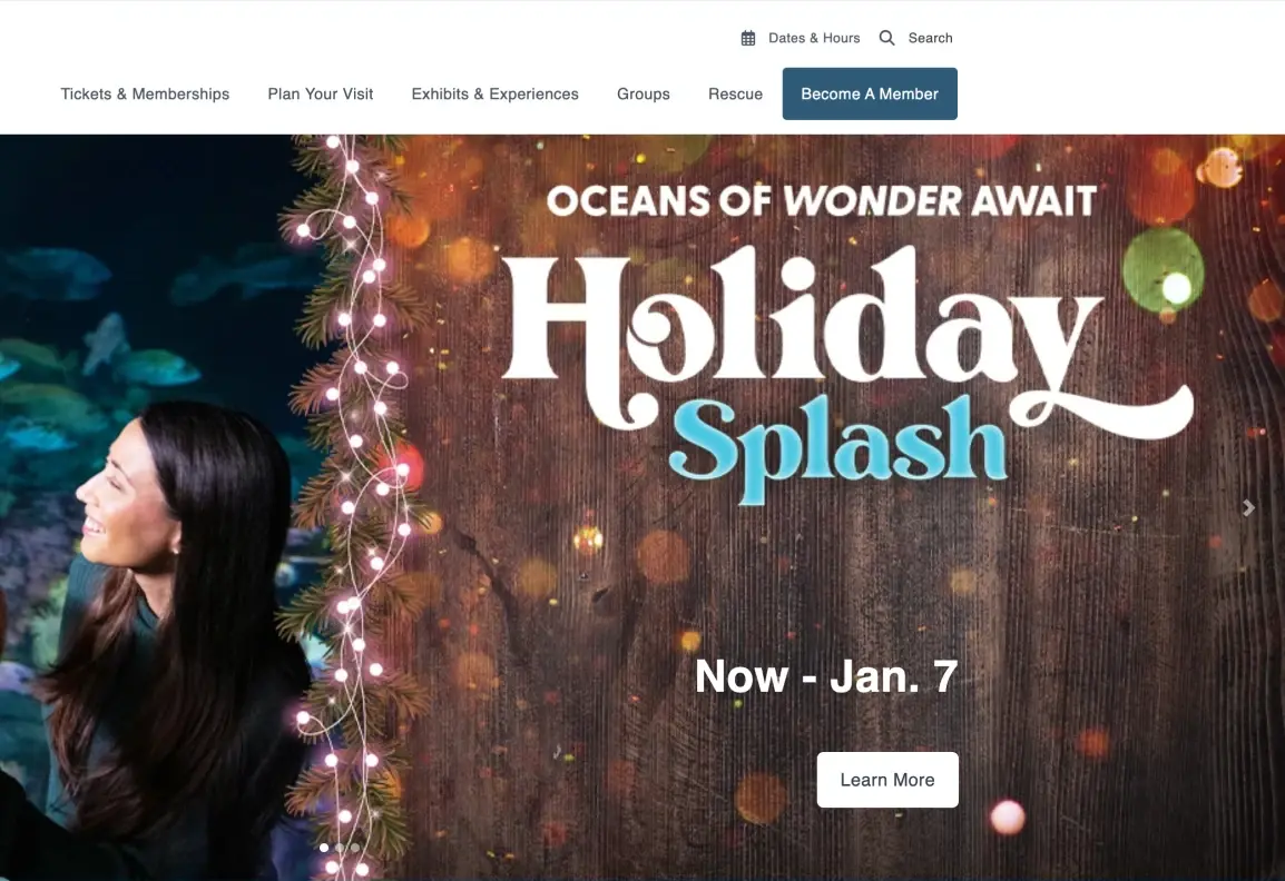
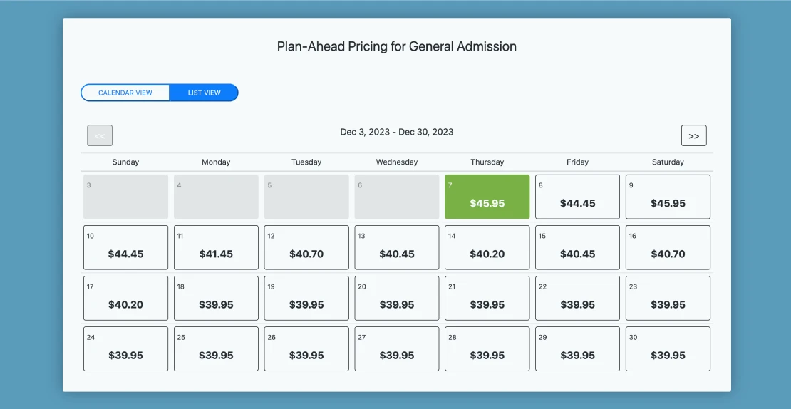
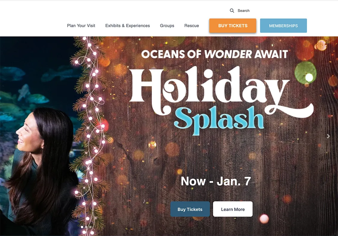
1. Improve UI design on landing page
- Remove ‘Date and Hours’ and 'Tickets and memberships' from the navigation bar.
- Add a custom calendar UI.
- Add clear Call to Action buttons on banner.
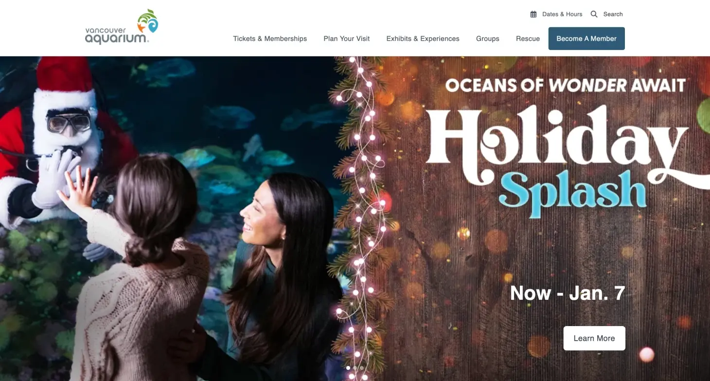
Before
Old landing page
After
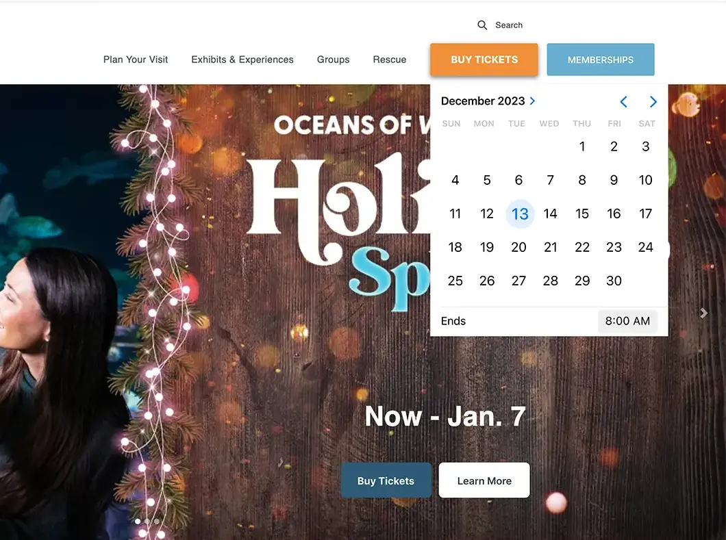
New landing page
2. Showcase membership clearly during check-out
- Add a comparison matrix between buying single tickets and buying a membership.
- Add toast message about memberships on top of input section.
- Display pop-up message when user selects two dates to buy.
Before
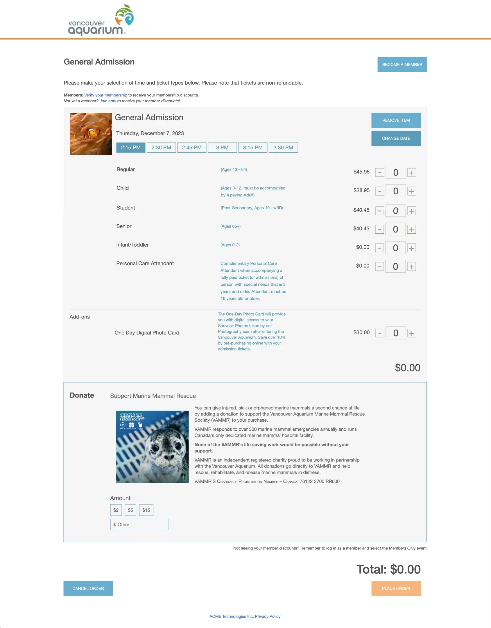
Old checkout page
After
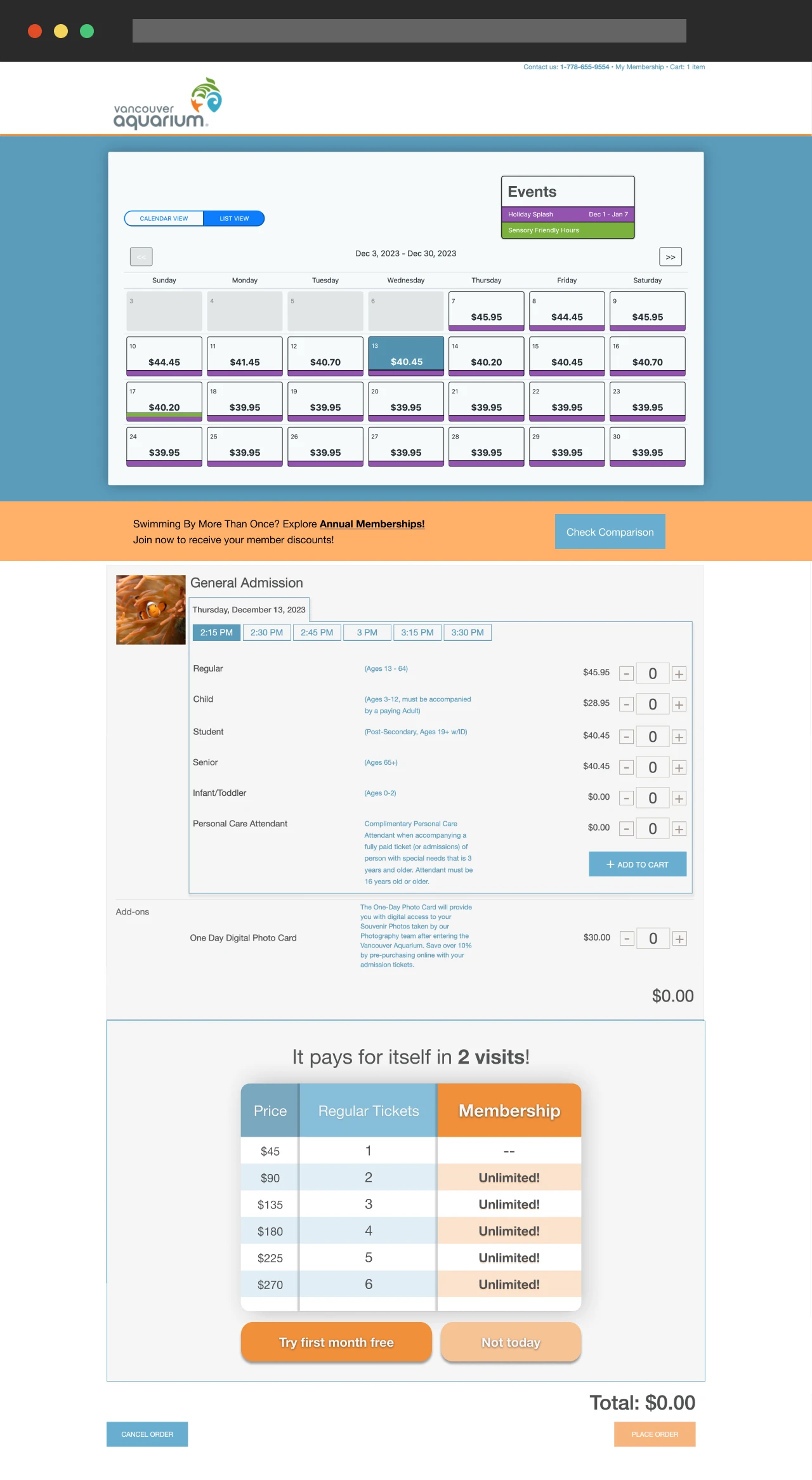
New checkout page
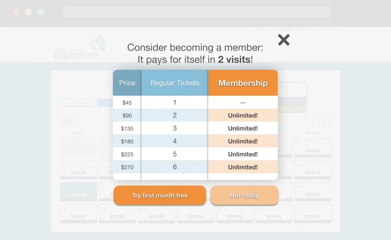
Popup when 2 dates are selected
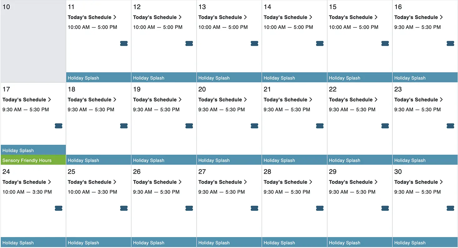
3. Simplify the buying process for special events
- Add buy ticket and learn more button in landing page banner.
- Add event schedule to calendar on ticket page.
- Simplify user path by eliminating three steps and combine them into a single page.
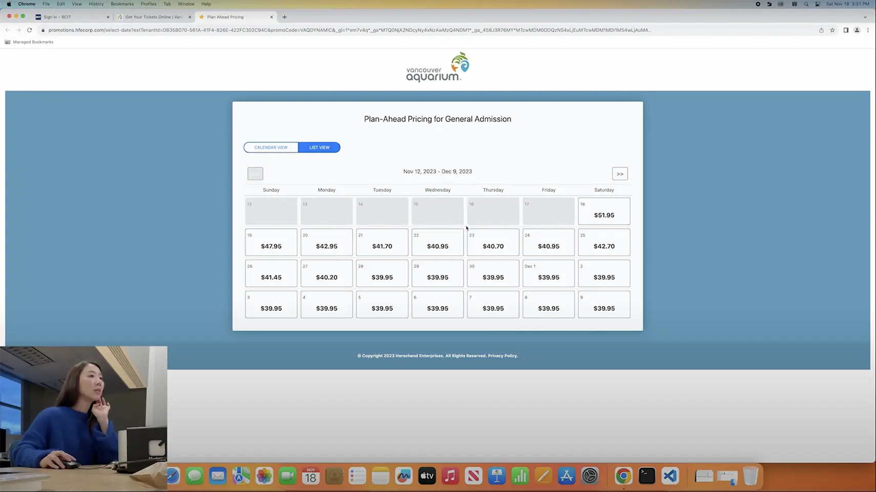
Before
Old calendars - One with pricing and one with event information.
After
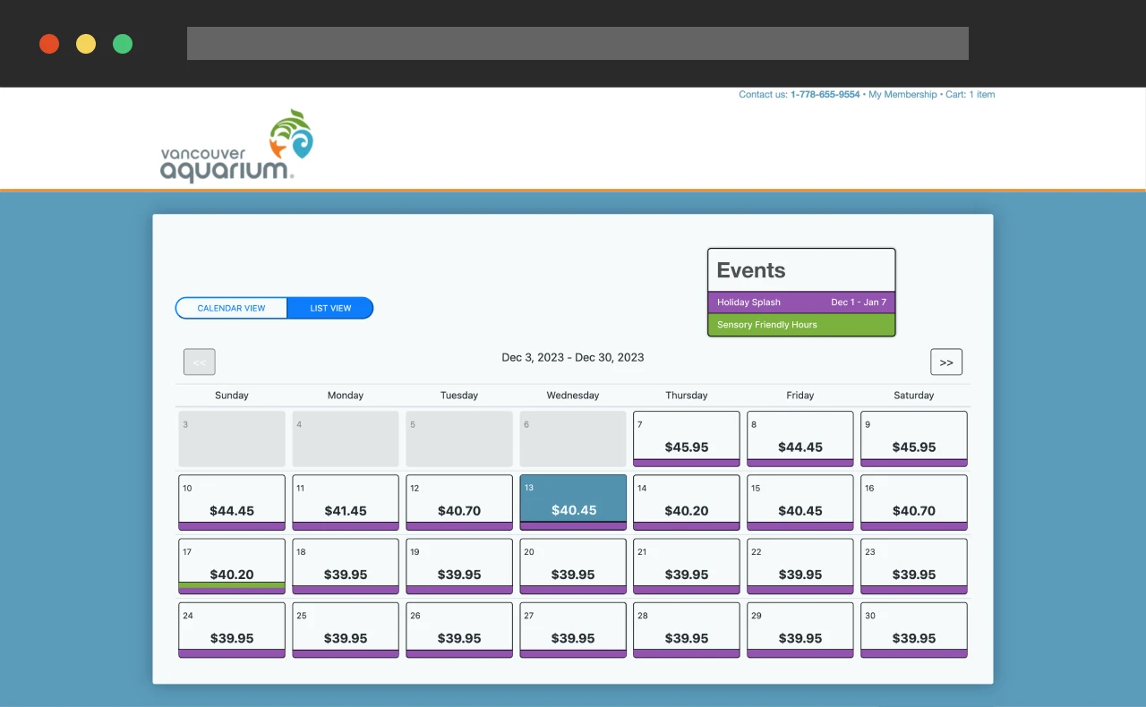
New calendar combining both pricing and event information.
Links to Special Event: "Buy Tickets" and "Learn More"
Reflection
Based on the design process I learned a couple of lessons:
- Beware of assumptions: Some hypothesis, while possible, couldn't be proven with current testing.
- Minimize influence: While moderating keep your assumptions and hypothesis hidden from the test subjects.
Next Steps
Next steps for the project would be:
- Implement code into website.
- Extend testing into payment process.
Thank you for reading!